In our very first Mentee Showcase, we hear from John Davies, Senior Environment Artist at Turn Me Up Games.
John shares his background and journey into the games industry, key lessons from his Vessel Forge experience, and gives us an in-depth breakdown of his personal project, Keep Ruins.
Q: How did you start your journey into art?
I started in art with photography and that led me into studying media art in undergrad at UCLA. I fell in love with making games in the few classes I got to explore it in and decided to continue my education at the University of Utah in their games graduate program. Even though I did a lot of schooling, so much of environment art is self-driven and self-taught.
Q: What led you to pursue a career in video game art?
I kind of fell into it by accident during undergrad. Creating 3D environments people can explore and experience is such a unique joy that I really just fell in love with it. I grew up playing a lot of games, but never saw a career in it until I became exposed to the art side. I knew I needed to learn more and get more guided experience, so I decided to attend graduate school once I had my heart set on making it a career. From there I spent some time bouncing around focusing on technical art or environment art, but my passion is really storytelling. So I started to focus on creating environments and practicing my craft.
Q: What do you enjoy about creating art for video games?
Creating a space and world that someone else can experience, enjoy, and lose themselves in is the best type of art. Games remove the lens from the artist and instead forces us to create compelling spaces, rather than focusing on fixed compositions. For me, the challenge of creating spaces that are great to explore brings the joy of creating video games even further than the joy I felt in my original art background, photography. Collaborating with many disciplines to give players a great experience is just so dynamic, fun and rewarding that ultimately, I can’t see myself doing anything else.
Q: What were some of your biggest takeaways or learnings from your mentorship?
Keep pushing storytelling, keep the quality bar high, and keep sharing your art as frequently as possible.
Q: Why did you decide to apply for a Vessel Forge mentorship?
I was looking for feedback from an excellent artist who I had no ties to. I wanted to spot check my artistic skills and this felt like the perfect opportunity to do that.
Q: Where can people find your art?
Artstation.com/jldavies or @jdenvart on Instagram!

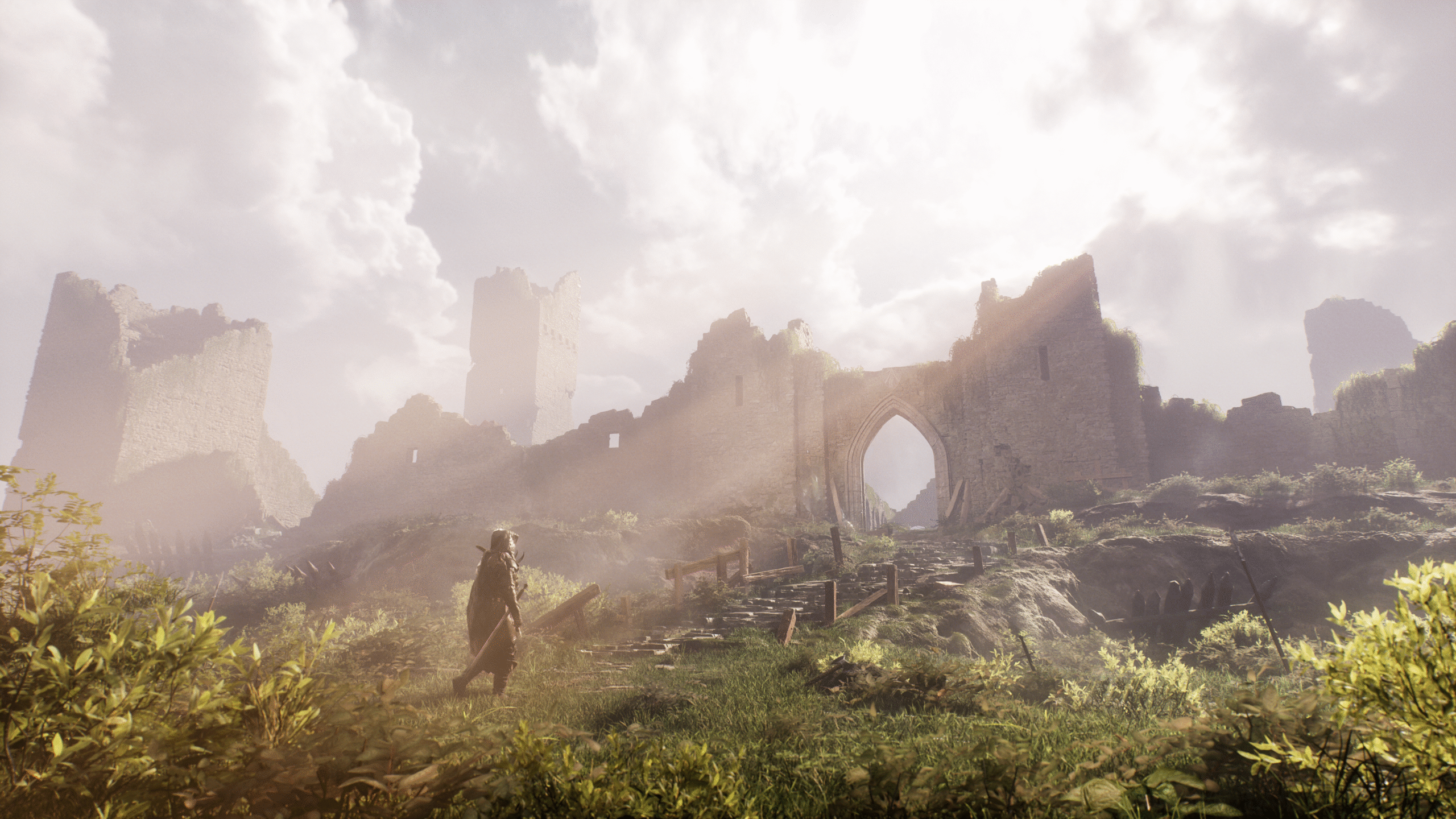
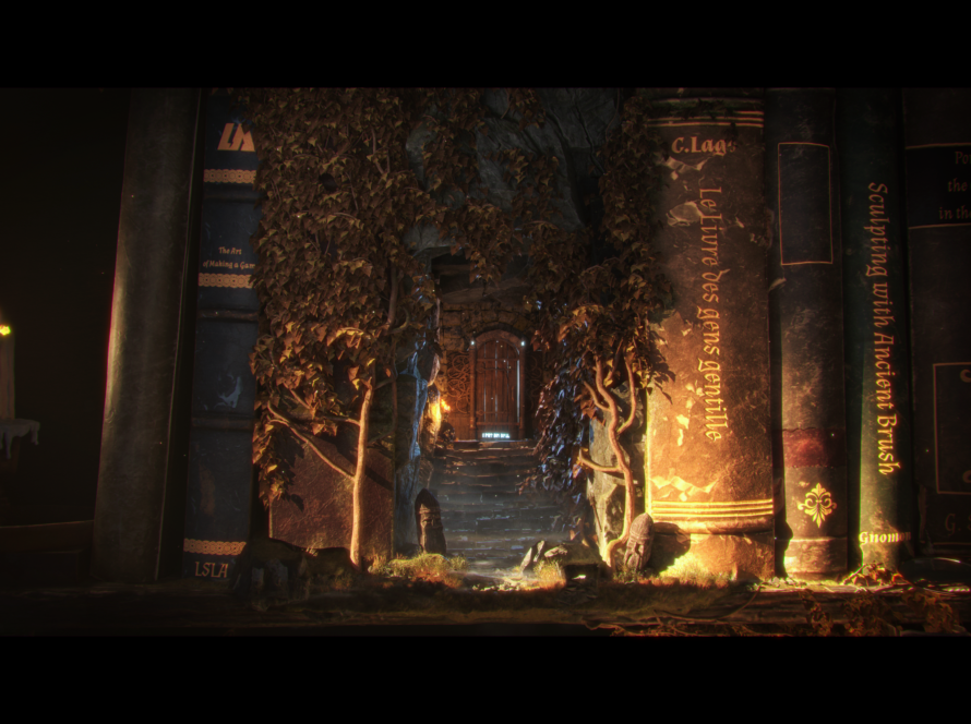
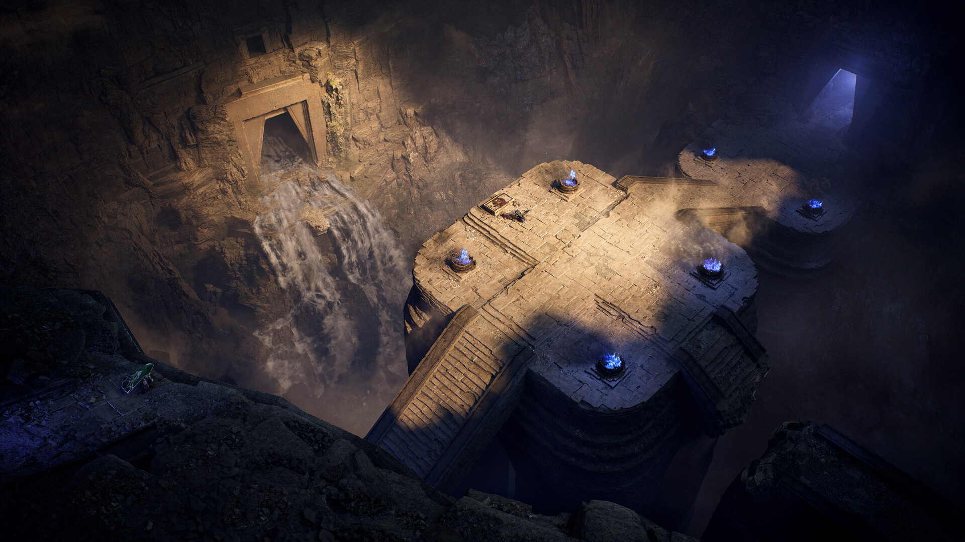
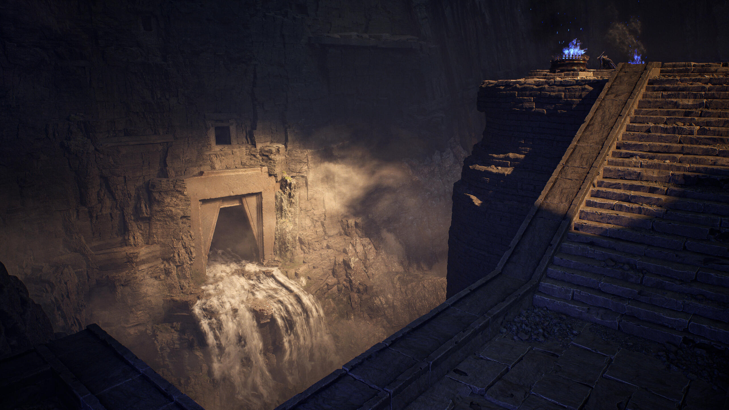
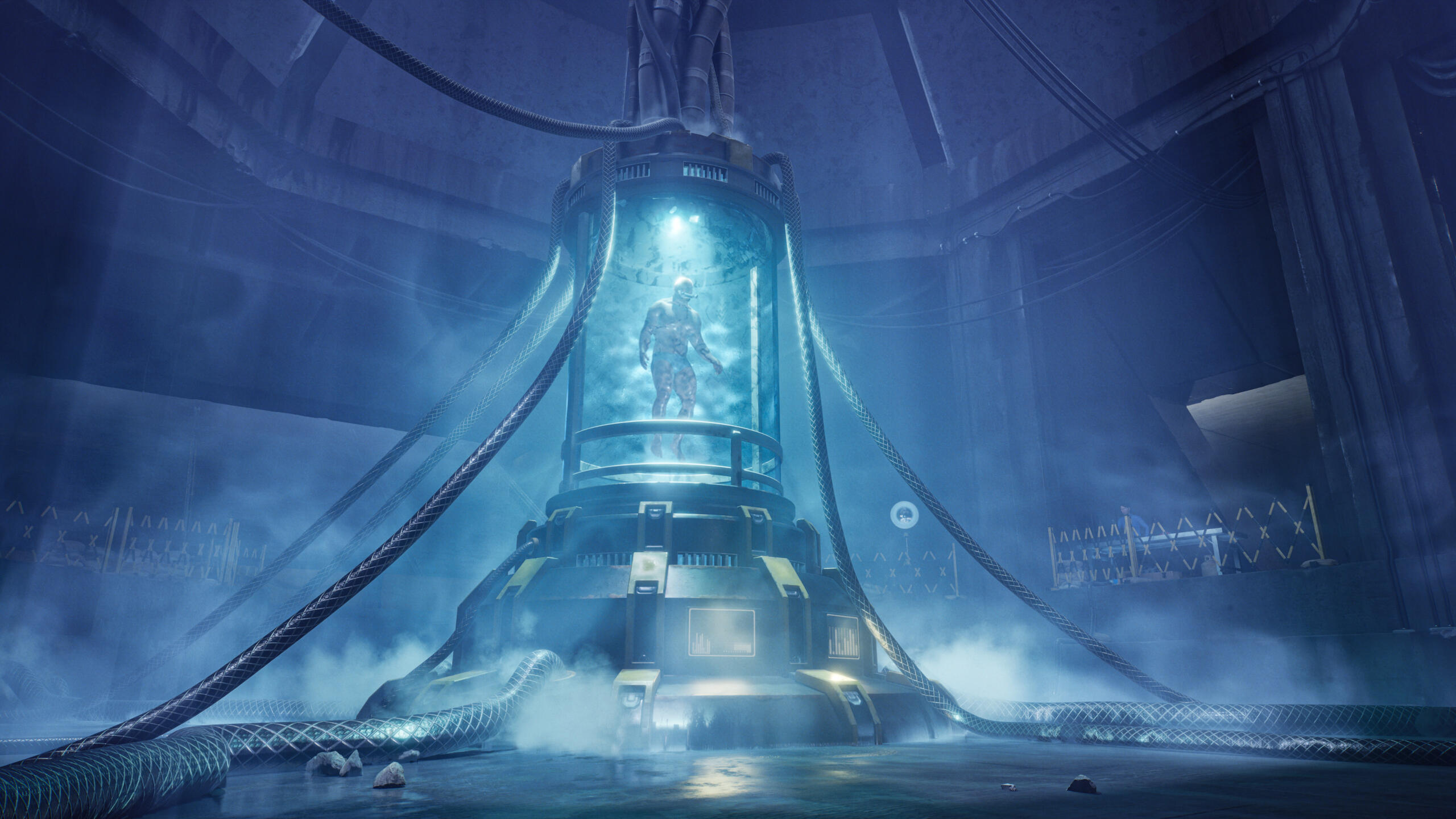
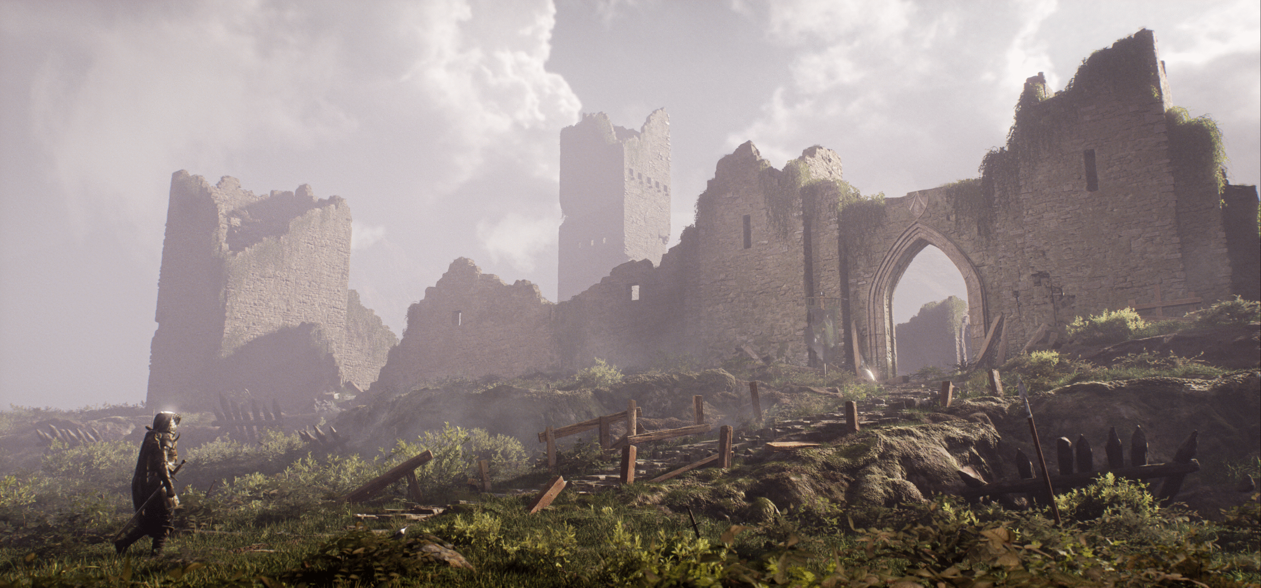
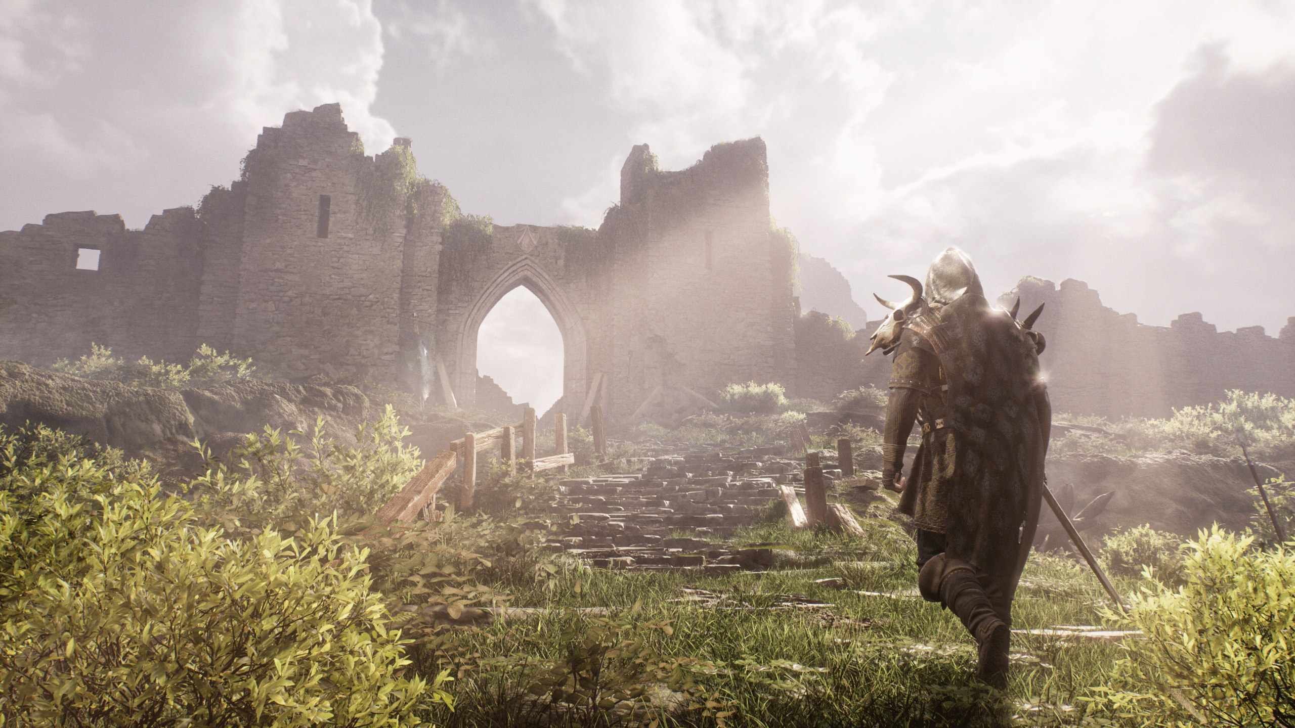
For this project, I really wanted to create a Dark Souls inspired scene focused around crumbling stone walls and multiple areas built out over a few consecutive projects. I wanted to really focus on the story and build on that narrative over each project. I started to gather some references to inspire the space and figure out how I wanted to separate it up to build on that narrative. After some tinkering, I settled on exploring this ruined keep from entrance to inner sanctum, having a character travel through the whole thing.
After figuring out a general floor plan for the fort and establishing a general workflow for the kit I was going to use, I felt comfortable to start figuring out the composition for the front gates. I used a handful of Megascans wall assets as stand-ins for my eventual kit pieces, finding them a little bit easier to work with than just standard cubes. With these I created a general flow for the walls, center gate, and back towers focusing on leading the eye to the arch.
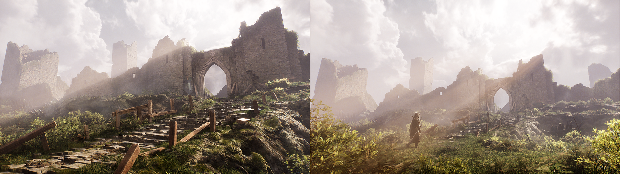
I bounced back and forth between my shot from the stairs and the farther shot as my key angles, really struggling with making it feel grand and epic enough scale-wise. For most of the project I focused on the shot from the stairs to hone-in on that epic scale. Only later on, once everything was fleshed out, did the farther away shot start to feel the best. Because these two shots shared the same angle relative to the walls this approach worked out, but I cannot stress enough the need to keep your assets nice and organized in those early stages, otherwise iterating on composition after the whitebox phase can be extremely tedious.
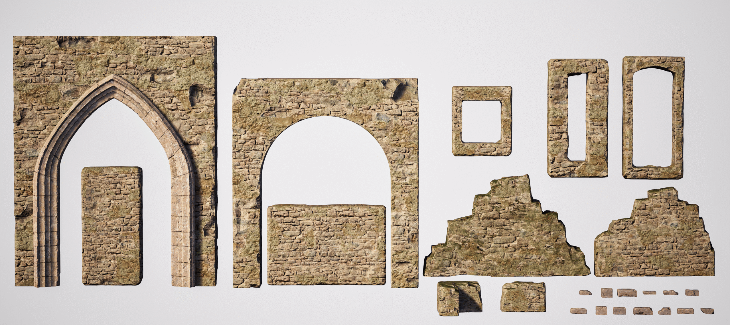
I wanted to create a really organic kit that is best used by just clipping assets together, rather than needing flush edges, to really allow myself to make unique shapes and not worry about having to conform too much to standardized flows. I found references of similar kits and used them to begin building out the pieces for my own. I started with 1×3 and 3×2 walls and built out the RGB material that I was going to use for the project, grabbing some textures from Megascans to make up the material layers. I’ll share a few tips from that material down below.
With the material figured out I created my ruined walls one at a time and tested them with my standard walls, trying to make the shapes I wanted. With that info I made my second one and my pair of parapets to give me some more flexibility. Then I moved onto my bricks, which I jammed into the meshes to create some variation. I took that approach to make them feel a little more stylized, so they’d really pop and not be nearly as noisy as the textures themselves. If they stood out too much I’d sub out with some noisier materials or layer with some decals to make them fit a little bit better, but I really wanted to have them be high contrast initially.
Finally, I made my trio of window meshes, just so I didn’t have to rely too heavily on creating boolean meshes for every intentional window or arrow slit in the walls. Both arch walls were made separately, with the round arch structure being kitbashed out of my bricks and the pointed arch structure also being made in ZBrush.
One extra tip, if you haven’t started yet, please make sure to utilize the new boolean modeling tools within Unreal! They’re an amazing tool to quickly iterate and not have to hand make all these little individual variations on meshes.
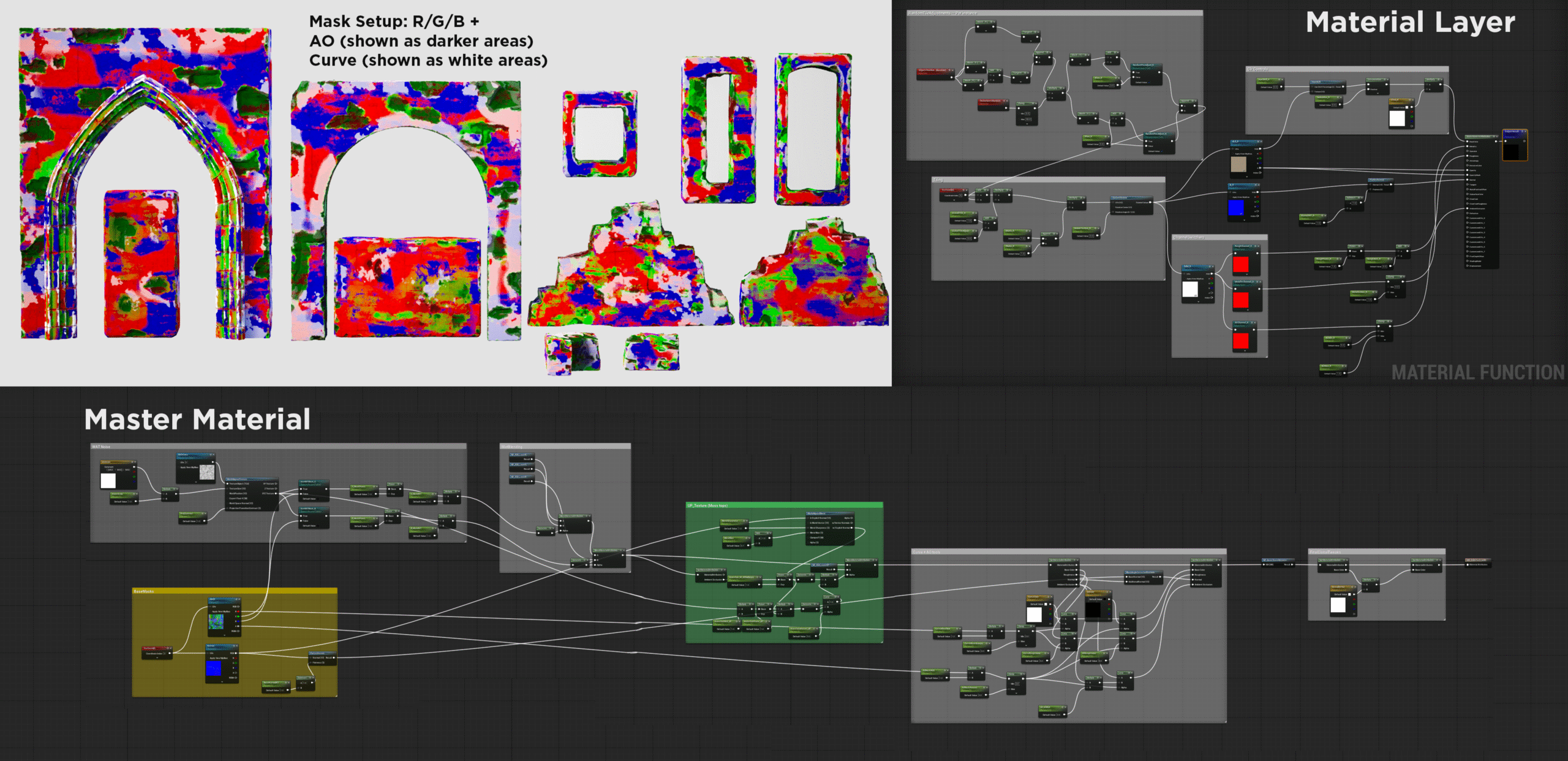
For the material, I wanted to make this slightly more organized and created 3 material layer MFs to use, which was really worth the time I put in and made life much easier. The material is fairly standard if you’re familiar with RGB mask workflows: standard 3 layer setup with curvature and AO masks included for highlights/shadows and a world aligned blend for tops of meshes. The main changes I made were: including the option to ignore my pre-made masks and use a global world aligned noise for any of the channels, and a few extra tools in the base material layers.
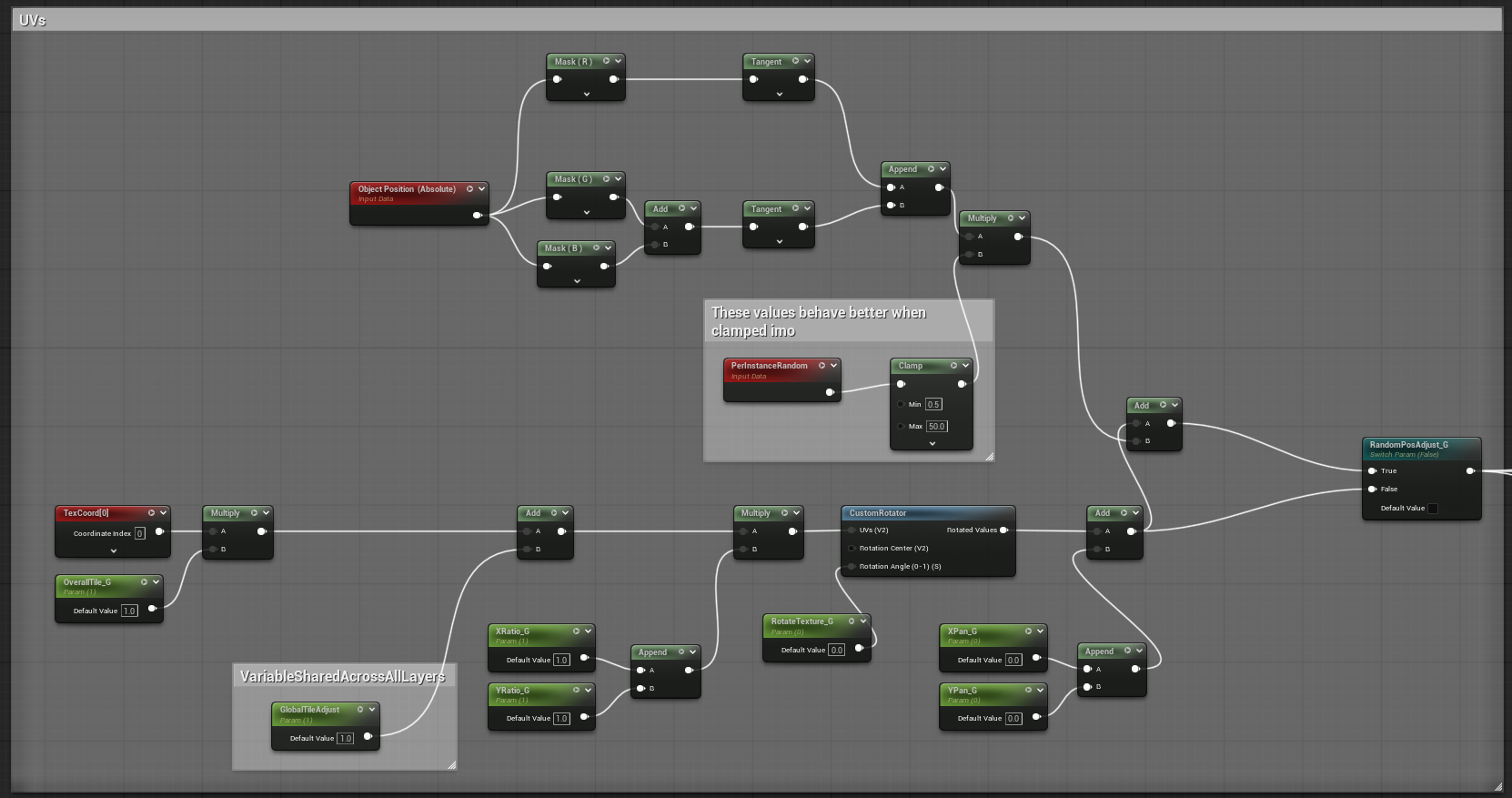
My favorite optimization detail was that I also included an option to randomly pan the tileable textures per object (shown above). This change really fit with how my kit was designed and brought endless randomness to my walls. As I was using a mix of Megascans, other fab content, and personally created content, I set up my mask map in each material layer to have channel parameters to select what each mask map’s channel was actually supplying. This allowed me not to worry about having different types of material layers for different mask maps or having to create differently packed maps in Designer by hand.
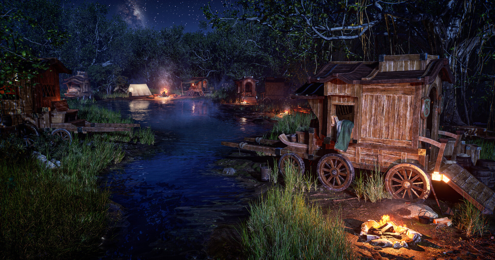
For the terrain I’ve become accustomed to a plugin called Magic Map Material & Maker (M4) for quickly creating a base terrain with a placeholder material and grass maps included. Having a terrain fully fleshed out is super helpful for me, I honestly don’t get much from base shapes of terrain without at least colors, so it’s become really nice to adopt this in my workflow to iterate with a terrain filled with textures and foliage. That being said, if the terrain shapes are a huge part of the project I’ll use something like World Creator, but with projects like this all I’m looking for is some cool, natural variation and a nice open valley to build in.
The most important thing when using plugins or generative workflows is not to leave them in their base state. Always go back and supplement them with custom assets so they don’t stay generic and best suit your project! In my case, I replaced the textures and foliage with Megascans content, which upped the quality bar a lot and allowed me to tweak the pre-generated biome created by the plugin. Another major tip when using grass layers for your foliage in a project is to always go back and hand place foliage in key areas of your composition, especially close to the camera. You always want to have complete control over your artwork and you don’t want to risk generated grass maps messing things up in between different times opening your map.
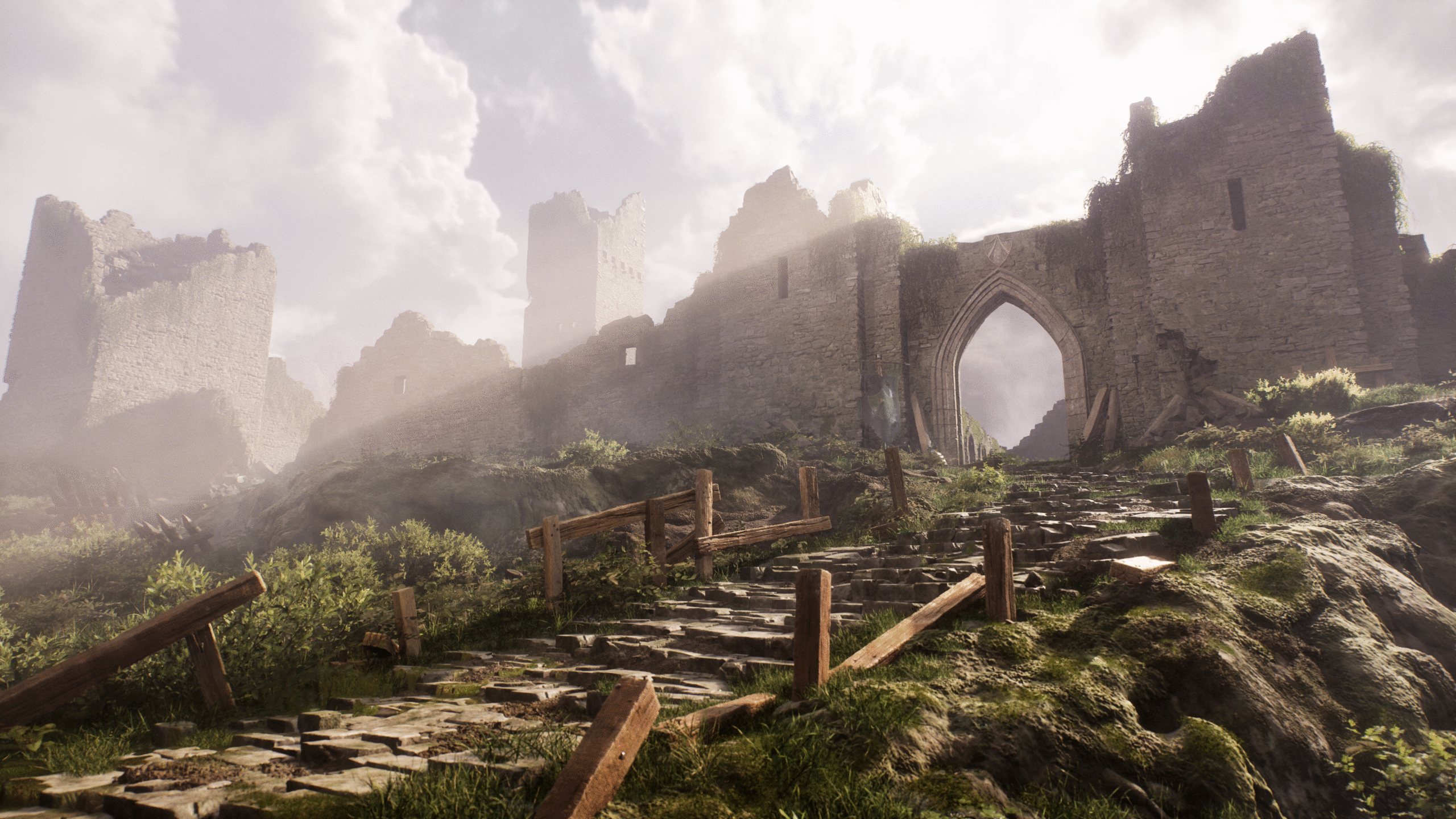
The first step when I start to polish up a project is always placing volumetric volumes, fog cards or particle effects to enhance my lighting. Using tools like William Faucher’s EasyFog is a great starting point, but I’d highly recommend looking into shader-based volumetric fog as well! For close ups and videos it makes a huge difference.
Once I’m happy with all of my base lighting, I make my sequences for each render and start to make individual changes per shot. This is a necessary part of the workflow when using movie render queue, but the big benefit is making tiny changes to the scene for each render. In this project, the sun angle, sky position, character position, various shadowblockers, and tons of props were all tweaked slightly per shot. As long as you’re making changes correctly in the sequence, nothing should conflict, and it allows each shot to stand on its own much better. Finally, I’ll add the last few finishing touches to my post processing, which includes adding some film grain, sharpening, and tweaking a couple elements in local exposure in my post process volume – especially detail strength and highlight/shadow contrast.
Thank you for reading. I hope this was helpful or inspired you to keep making art and pushing your skills!